Color psychology plays a vital role in how you feel within your home. Different colors can evoke various emotions, shaping your living space’s atmosphere. For example, bright colors like red and orange can energize a room, while softer tones like greens and blues promote calmness. Textiles also contribute significantly to mood creation. Using color in your home, such as incorporating plush rugs or natural fabrics, adds warmth and comfort. These elements work together to transform a space into a haven that reflects your personality and enhances your well-being.
Key Takeaways
Colors significantly impact your emotions and can enhance your mental well-being.
Warm colors like red and yellow energize spaces, while cool colors like blue and green promote calmness.
Textiles and patterns add depth to your décor, influencing the mood of your home.
Experimenting with different color schemes helps you find what feels right for your space.
Consider the function of each room when choosing colors to create the desired atmosphere.
Understanding Color Psychology
Basics of Color Psychology
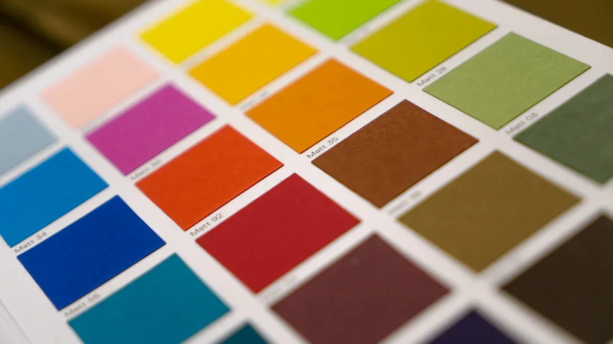
Color psychology explores how colors influence your feelings and behaviors. Each color carries its own set of meanings and associations. For instance, red often symbolizes power and passion, while blue is linked to calmness and trust. Understanding these associations can help you create a space that resonates with your desired mood.
Here’s a quick overview of some common colors and their emotional impacts:
Color | Feeling or Emotion | Type of Color |
|---|---|---|
Red | Power and Sensuality | Primary |
Yellow | Happiness and Optimism | Primary |
Blue | Serenity and Loyalty | Primary |
Green | Growth and Vitality | Secondary |
Purple | Passion and Intensity | Secondary |
Orange | Creativity and Energy | Secondary |
White | Goodness and Purity | Non-color |
Black | Elegance and Sophistication | Non-color |
Colors have various characteristics that can drastically change the mood they create. Attributes like tint, shade, tone, value, saturation, and chroma are essential in crafting an effective interior design palette. For example, tints can create a serene atmosphere, while shades can add depth and balance.
Emotional Responses to Color
Your emotional responses to color can vary based on personal experiences and cultural backgrounds. Research shows that warm colors like red and orange often evoke feelings of energy and warmth. In contrast, cool colors such as blue and green promote tranquility and relaxation.
Here are some common emotional responses to specific colors:
Red: Linked with energy, excitement, passion, and danger.
Blue: Associated with calmness, trust, relaxation, and sadness.
Yellow: Evokes happiness, warmth, and can lead to overstimulation.
Green: Symbolizes nature, balance, and can also represent jealousy.
Purple: Represents luxury, creativity, and spirituality.
Black: Associated with sophistication, power, and mystery.
White: Symbolizes purity, cleanliness, and can feel sterile.
Studies have shown that colors can significantly impact your emotional well-being. For instance, exposure to blue in built environments affects emotional processing. This research highlights how color choices in your home can influence your feelings and overall mood. Soft tones, characterized by high value and low chroma, create soothing and comfortable spaces.
By understanding the psychology of color, you can make informed decisions about your home décor. Whether you want to energize a room or create a peaceful retreat, the right colors can help you achieve your goals.
Paint’s Impact on Mood
Warm Colors and Energy
Warm colors like red, orange, and yellow can significantly boost energy levels in your home. These colors create an inviting atmosphere that encourages interaction and activity. Here’s how each color contributes to the mood:
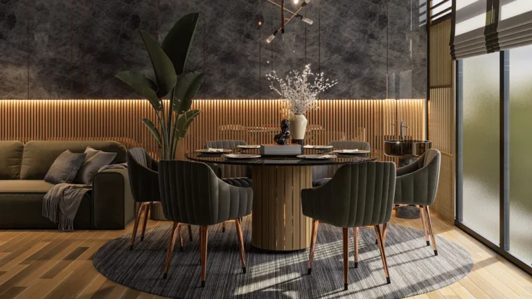
Red: This vibrant hue raises your heart rate and stimulates conversation. It’s perfect for active spaces like dining rooms where you want to foster lively discussions.
Orange: This cheerful color promotes creativity and optimism. It’s ideal for playrooms or home offices, encouraging fun and collaboration.
Yellow: Known for its association with happiness, yellow can make spaces feel larger and more cheerful. It’s a great choice for kitchens and children’s rooms, where you want to inspire joy and energy.
Using warm colors strategically can create a cozy and inviting atmosphere. They evoke feelings of warmth and familiarity, making large spaces feel more intimate. When you want to energize a room, consider incorporating these colors into your paint choices.
Cool Colors and Calmness
Cool colors like blue and green are your go-to options for creating a calming atmosphere. These shades are often linked to nature and water, which evoke feelings of tranquility and serenity. Here’s how they work:
Blue: This color promotes calmness and trust. Studies show that it can lower heart rates and create a peaceful environment. Imagine a soft blue in your bedroom, helping you unwind after a long day.
Green: Associated with nature, green can induce feelings of peace and harmony. Soothing shades of green can make your living space feel restful and rejuvenating.
Research supports the idea that incorporating cool colors in your home can lead to a more peaceful environment. A study titled “Effects of interior colors on mood and preference” found that cool colors are linked to feelings of calmness and spaciousness. If you want to create a serene retreat, consider using these calming colors in your interior design.
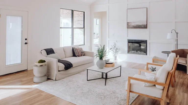
Neutral Colors and Versatility
Neutral colors like beige and gray offer incredible versatility in mood creation. They serve as perfect backdrops that can influence the overall atmosphere of your space. Here’s how they can enhance your home:
Neutral colors evoke feelings of calmness and warmth, making your home feel inviting and comfortable.
Warm undertones in these colors can enhance the overall atmosphere, allowing for adaptability in various design styles.
Using warm neutral paint colors can add softness and a subtle glow to a room. They create a comfortable, lived-in feel that stands the test of time. For example, warm grays, often called ‘greige’ or ‘taupe,’ combine sophistication with warmth, creating a balanced and welcoming atmosphere.
Incorporating neutral colors allows you to experiment with colorful decor elements without overwhelming the space. They serve as a blank canvas for creativity, enabling easy updates to your décor.
By understanding how different paint colors impact mood, you can create spaces that reflect your personality and enhance your well-being.
Textiles and Mood
Fabric Choices and Emotions
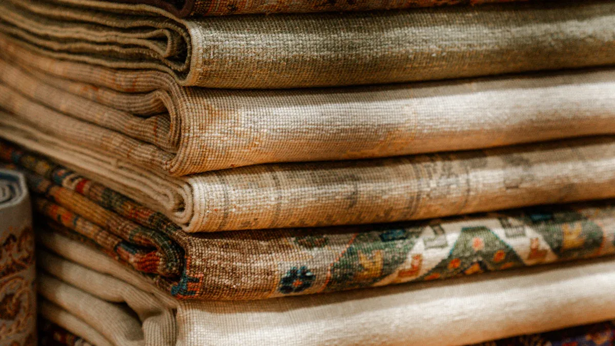
The fabrics you choose for your home can greatly influence the mood of your space. Different materials evoke different feelings. For instance, soft textiles like cotton and linen create a relaxed atmosphere. On the other hand, luxurious fabrics like velvet add a touch of elegance and comfort.
Cotton: This breathable fabric feels light and fresh, making it perfect for casual spaces.
Linen: Known for its natural texture, linen brings a relaxed vibe to any room.
Velvet: This rich fabric creates a sense of opulence and warmth, enhancing the ambiance of your space.
By selecting the right textures, you can significantly influence the mood of a room. For example, in a corporate office, sleek and tailored textures promote professionalism. In contrast, soft and plush textiles like chenille and velvet are ideal for creating a warm and inviting atmosphere in hospitality settings.
Patterns and Textures
Patterns in textiles also play a crucial role in shaping the mood of your home. Research shows that repeating patterns tend to evoke more pleasure, while intense patterns can generate excitement.
“Participants registered an increase of theta brain waves in response to repeating patterns, correlating with pleasant emotions. Conversely, non-repeating patterns were found to be less pleasant, and weaker patterns were more calming.”
Using patterns wisely can enhance your interior design. For instance, floral or geometric patterns can add energy and vibrancy to a room. In contrast, subtle, muted patterns can create a serene and calming environment.
When you mix and match different textures and patterns, you create a dynamic space that reflects your personality. So, don’t hesitate to experiment! Layering various fabrics can add depth and interest, making your home feel more inviting and unique.
Combining Colors Effectively
Color Schemes for Desired Moods
Choosing the right color scheme can significantly impact the mood of your space. Here’s a handy table that outlines some effective color schemes and their corresponding moods:
Color Scheme | Mood/Effect |
|---|---|
Purple | Luxury and creativity; calming in lighter shades, dramatic in deeper shades. |
White | Purity and cleanliness; versatile backdrop, can feel sterile if overused. |
Gray | Elegant and sophisticated; provides calm and balanced backdrop. |
Beige | Comfort and coziness; ideal for relaxed environments. |
Blue | Calming effect; promotes relaxation and better sleep. |
Red | Stimulates appetite and conversation; best as an accent color. |
Warm Neutrals | Cozy and inviting atmosphere; enhances comfort. |
Yellow | Uplifting and creative; ideal for children’s spaces but should be balanced. |
Jewel Tones | Sophisticated and intellectual; promotes productivity and creativity. |
These color schemes can help you create the atmosphere you desire. For example, if you want a cozy and inviting space, consider warm neutrals or beige. If you’re aiming for a calming retreat, blue or gray might be your best bet.
Tips for Harmonizing Colors
Harmonizing colors in your home can create a cohesive and inviting environment. Here are some practical tips for designing with color:
Use a continuous color palette across rooms to create flow and avoid jarring transitions.
Choose calming colors for bedrooms and energizing tones for kitchens to enhance mood.
Light colors can make small spaces feel larger and more open.
Ensure that colors blend well with furniture and textiles for a cohesive look.
Consider the function of the room when selecting colors, such as softer hues for bedrooms.
Take into account the natural lighting in your space to choose appropriate shades.
You can also change major textiles like curtains or rugs to make a dramatic impact without painting. Textiles can frame and anchor the room, enhancing the overall décor. By following these tips for harmonizing colors, you’ll create a space that feels balanced and inviting.
Practical Applications in Interior Design
Case Studies of Color Use
Real-life examples can show you how effective color choices can be in transforming spaces. Here are a few case studies that highlight successful use of color in interior design:
Project Name | Color Choices and Effects |
|---|---|
Carriage Lane Addition | Bold tones like purple and green create a vibrant atmosphere; warm blues in the kitchen enhance the welcoming feel. |
Granger Kitchen and Laundry Remodel | Rich walnut cabinets add warmth; blue, yellow, and red accents provide vibrant pops, enhancing the overall aesthetic. |
Woodland Hills Remodel | A harmonious blend of earth tones and natural wood accents creates a serene and elegant environment. |
These projects illustrate how color in interior design can evoke specific feelings and enhance the overall experience of a space.
DIY Color Projects
You don’t need to hire a designer to create a mood-enhancing environment. Simple DIY projects can make a big difference. For example, you can transform a dull room into a vibrant space just by changing the paint color. One homeowner painted their walls gray, a color associated with calmness and peace. This choice uplifted their spirits and changed the room’s atmosphere entirely.
Here are some DIY tips to help you create specific emotional atmospheres:
Swap heavy, dark textiles for lighter options like linen or cotton to create a sense of airiness.
Incorporate vibrant colors and natural elements, such as potted plants or fresh flowers, to uplift the mood.
Paint an accent wall in a bright hue or create a gallery wall with seasonal artwork to enhance the emotional atmosphere.
By using these techniques, you can effectively apply color psychology in your home. Remember, the right color choices can significantly impact how you feel in your space.
Color choices play a crucial role in shaping the mood of your home. Research shows that colors significantly affect your emotions and behavior. By selecting hues that resonate with your feelings, you can create spaces that uplift or calm you.
Here are some key takeaways to remember:
Colors can influence your mental health and overall happiness.
Experimenting with different palettes helps you discover what feels right for you.
Be mindful of how colors interact with light and other design elements.
So, don’t hesitate to try new colors in your home! Whether you want a vibrant living area or a calming bedroom, the right shades can make all the difference. 🎨✨
FAQ
What colors are best for a calming bedroom?
Soft blues and greens work wonders for creating a calming atmosphere. These colors promote relaxation and help you unwind after a long day. Consider using light shades for walls and bedding to enhance tranquility. 🌿
How can I use color to make a small room feel larger?
Light colors like whites, soft grays, and pastels can make a small room feel more spacious. They reflect light and create an airy feel. Use these shades on walls and larger furniture pieces to maximize the effect. 🏡
Can I mix different color schemes in one room?
Absolutely! Mixing color schemes can add depth and interest. Just ensure that the colors complement each other. Use a unifying element, like a common pattern or texture, to tie everything together. 🎨
What role do textiles play in color psychology?
Textiles add warmth and texture to your space. The colors and patterns of fabrics can evoke emotions and set the mood. Choose soft, inviting materials for comfort, and vibrant patterns for energy. 🛋️
How often should I change my home’s color scheme?
You don’t need to change your color scheme often. However, refreshing your space every few years can keep it feeling vibrant and new. Consider seasonal updates with textiles or accessories for a quick change. 🌼